Branding
Ləpə — Brand Concept for a Seaside Ice Cream Kiosk
About the project
Ləpə is an internal NS Studio concept: a sample brand for a small ice cream kiosk on the Caspian promenade, not a client commission.
The name means the little wave that runs up the shore. The idea is simple: ice cream tastes of summer, the sea and an evening walk.
The project shows NS Studio’s approach to branding and logo design: name, logo, colour, type and applications in one system.


Logo, Badge and a Wave System
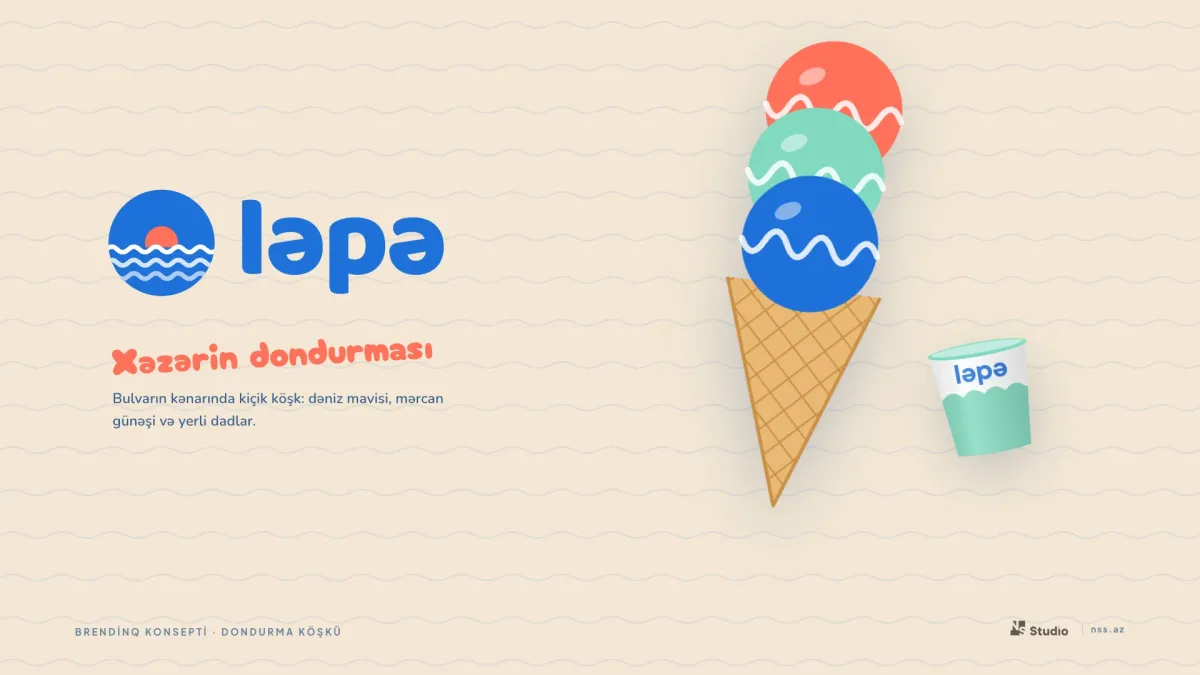
The badge shows the sun rising over the sea: a coral sun and three white waves. Next to it sits the round, friendly word “ləpə” — easy to remember for a child and a tourist alike.
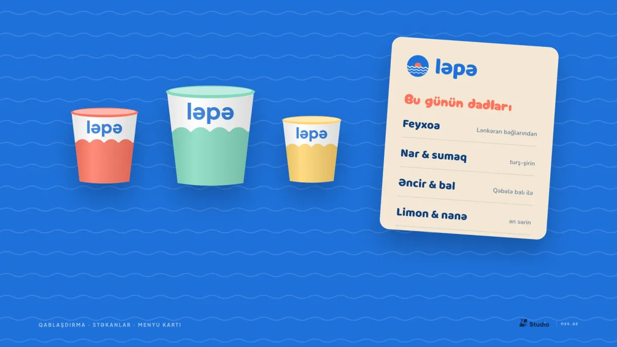
The palette is named after flavours: Sea, Mint, Coral, Lemon and Foam. Even the scoops are drawn as waves, so the core motif repeats everywhere.
Baloo 2 is used for headlines, playful Cherry Bomb for slogans and Nunito for the menu. The visual system follows NS Studio’s UI/UX design and branding approach.

Cups, Menu and the Kiosk Façade
Paper cups are dipped in a wave of colour, and the menu card lists local flavours: feijoa, pomegranate & sumac, fig & honey, lemon & mint.
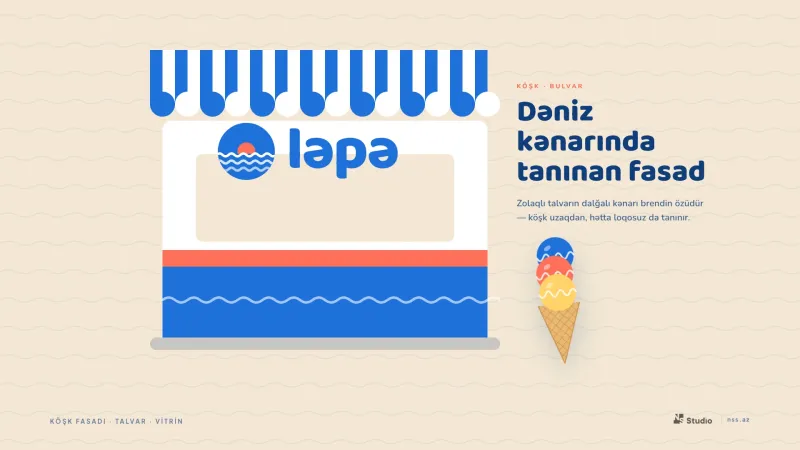
The scalloped edge of the striped awning is the brand itself — the kiosk is recognisable from afar, even without the logo. Social posts, a tote bag and stickers carry the same language.
Explore more of our work in the portfolio, or get in touch about your own brand.
Related service
Want a similar project?
Logo design, corporate identity and UI/UX design. A visual identity and brand book that express your brand’s character. Build your brand with NS Studio.
More projects
View all
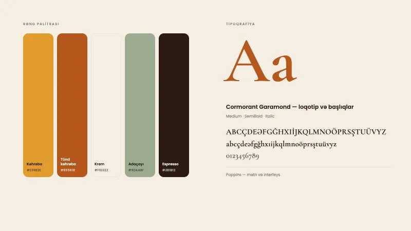
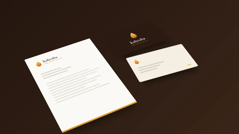
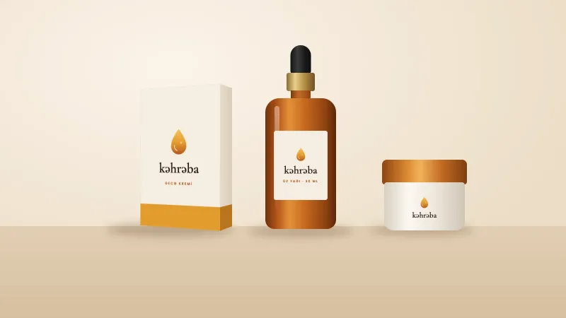
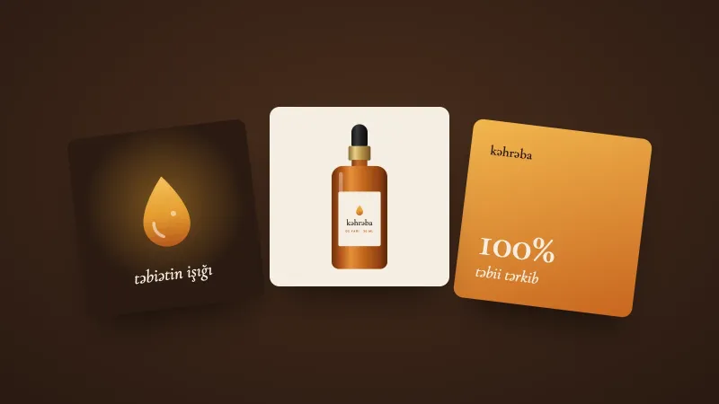
Kəhrəba — brand concept for natural skincare
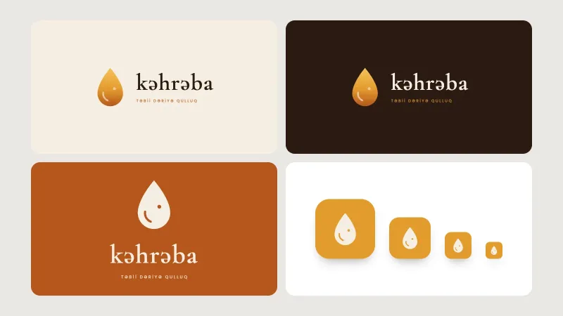
Kəhrəba is an in-house NS Studio concept project: a sample brand for natural skincare products, not a client commission. The name means "amber" in Azerbaijani — a natural stone formed from tree…