


Branding
Palıd — brand concept for an architecture studio
About the project
Palıd is an in-house NS Studio concept project: not a client commission, but a showcase of how a brand for an architecture and interior studio can be built.
The name means “oak” in Azerbaijani — strength, longevity and natural materials. The core idea of the brand: architecture brings people and nature together in one space.
Logo and visual system
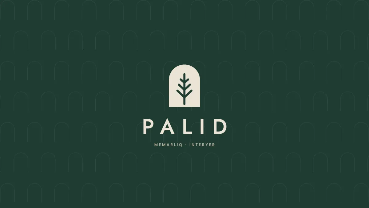
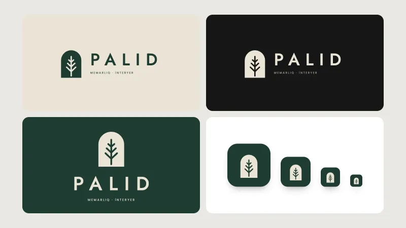
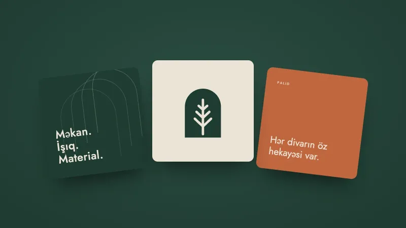
The mark combines two images: an arched doorway and the veins of an oak leaf inside it. Drawn in negative space, the tree speaks of both architecture and nature.
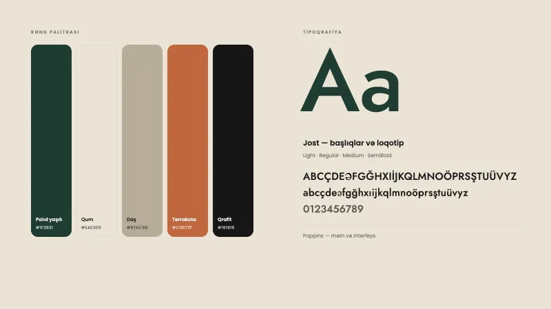
- Colours: oak green, sand, stone, terracotta and graphite — a palette of natural materials.
- Typeface: Jost with wide letter spacing for a calm, architectural rhythm; Poppins for body text.
- Versions: horizontal and stacked logo, a one-colour variant and an icon for small sizes.
Brand applications
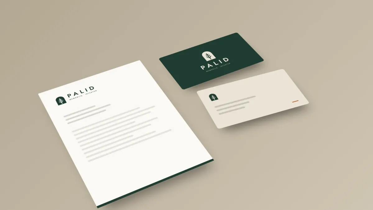
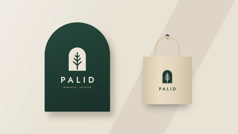
The visual system speaks the same language across every touchpoint — from the letterhead and business cards to the arched sign at the office entrance, a canvas tote and social media templates. The arch motif doubles as a pattern, so the brand stays recognisable even without the logo.
We can build a system like this for your brand too — from the logo to the brand book.
Related service
Want a similar project?
Logo design, corporate identity and UI/UX design. A visual identity and brand book that express your brand’s character. Build your brand with NS Studio.
More projects
View all
Sumaq — brand concept for a restaurant
Sumaq is an in-house NS Studio concept project: a sample brand for a modern Azerbaijani restaurant, not a client commission. Sumac is one of the most recognisable spices on the Azerbaijani table —…